The graph included in your savings report displays the parking lot costs with IPLC vs. costs without IPLC. Note these cost figures are strictly power consumption costs based on the simulation details, they do not incorporate any upkeep or other running costs. Below is a sample simulation and graph:
| Region: | Ottawa, Ontario, Canada |
| Vehicle Type: | Gasoline (Cars) |
| Plug-in Period: | 9:00 AM to 5:00 PM (8 hours) |
| Parking Stalls: | 50 |
| Price per kWh: | ¢6.000 |
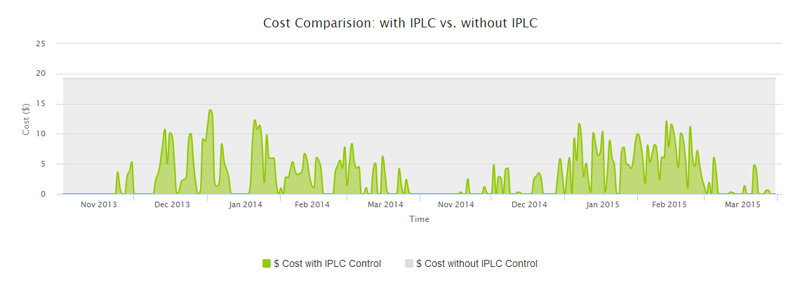
The horizontal gray area outlines your costs without an IPLC control. This amount is linear because your power consumption is fixed in this simulation. Meaning, for 8 hours per day seven days a week, 50 vehicles are plugged in consuming 800 watts each at a cost of 6.000 cents per kilowatt hour for the months included in the simulation. Therefore the cost calculation for each day will be: 8 x 50 x 0.8 x 0.06000 = $19.20 per day.
The horizontal green area outlines your costs with an IPLC control. You will notice this part of the graph has more highs and lows than the costs without an IPLC control. This is the case because the daily savings varies depending on the weather conditions. The IPLC actively monitors weather conditions such as windchill and temperature and will only provide power to the user if it is necessary based on programming and outside temperature. As such on extremely cold days, the IPLC will be providing power more regularly than on warmer days.
Lastly the gap between the top of the green area and the top of the grey area is your savings. The more gray you see, the bigger your savings with IPLC will be! Generate your free savings report now.